Essential cookies enable core functionality. The website cannot function properly without these cookies, and they can only be disabled by changing your browser preferences.
Advertisement cookies are used to provide visitors with relevant ads and marketing campaigns. These cookies track visitors across websites and collect information to provide customized ads.
Used to identify individual clients behind a shared IP address and apply security settings on a per-client basis.
By selecting “Accept all” you allow QualityHive and our partners to use cookies and to share your data for all these purposes.
We and our partners use cookies and similar tools to measure our site's audience, evaluate the performance of our ads, and show you personalized content and ads.
Except for cookies that are essential for navigating our site, we use these cookies and share your data only with your consent.
Automate client feedback with our MCP serverLearn more!
A good homepage tells a first-time visitor what you offer, who it is for and what to do next before they scroll, then backs that up with proof on a page that loads quickly on a phone. Each practice below comes with a test you can run in a few minutes, and the scorecard at the end turns those tests into a number.
We have left conversion statistics out on purpose. Industry averages rarely transfer to your site, so test your own homepage against your own analytics.
1. Hierarchy: one thing leads on every screen
The page should guide the eye in a clear order: headline, supporting line, main button, then the next section. Size, weight, colour and white space set that order, and problems usually come from too many elements competing for first place.
Use one <h1> that carries the main message, with headings below it in order.
Give each screen one dominant button.
Group related items and keep spacing consistent, so sections read as sections.
Test: blur it. Screenshot the first screen at 1440px and 390px wide and blur both heavily. The headline and the main button should still be the two most prominent shapes.
Test: headings only. Read only the headings down the page. They should tell a coherent story about what you offer.
2. Message: say what you do in one line
Jakob Nielsen's homepage guidelines were advising a one-sentence tagline that sums up what the company does back in 2002, and the advice has aged well. Headlines fail when they are about the company's feelings and leave out what it sells.
Here is the difference on a fictional accountancy firm:
Version
Headline
Weak
Welcome to Ashby, your trusted partner
Better
Fixed-fee accounts for UK sole traders
Say what you sell and who it is for in the headline.
Use the line below it for what makes you worth choosing.
Borrow your customers' words where you can.
Test: five seconds. Show the first screen to someone who does not know the business for five seconds, then hide it. Ask what the company sells and who it is for. If they cannot say, rewrite the headline.
Test: competitor swap. Put a competitor's logo in place of yours. If the headline still works, it is too generic.
3. Calls to action: one primary action
Decide the single most useful next step for a new visitor and make that the main button. Everything else is secondary and should look it.
Use a label starting with a verb that says what happens next, such as "Get a quote" or "Book a table".
Repeat the main action after your strongest proof and at the end of the page.
Test: button audit. List every button on the page. Each screen should have one primary style. Read the labels out of context, and each should say what happens when you press it.
Test: count the clicks. Starting from the homepage, count the clicks to complete your top task. Anything over three needs a reason.
Save countless hours on your projects
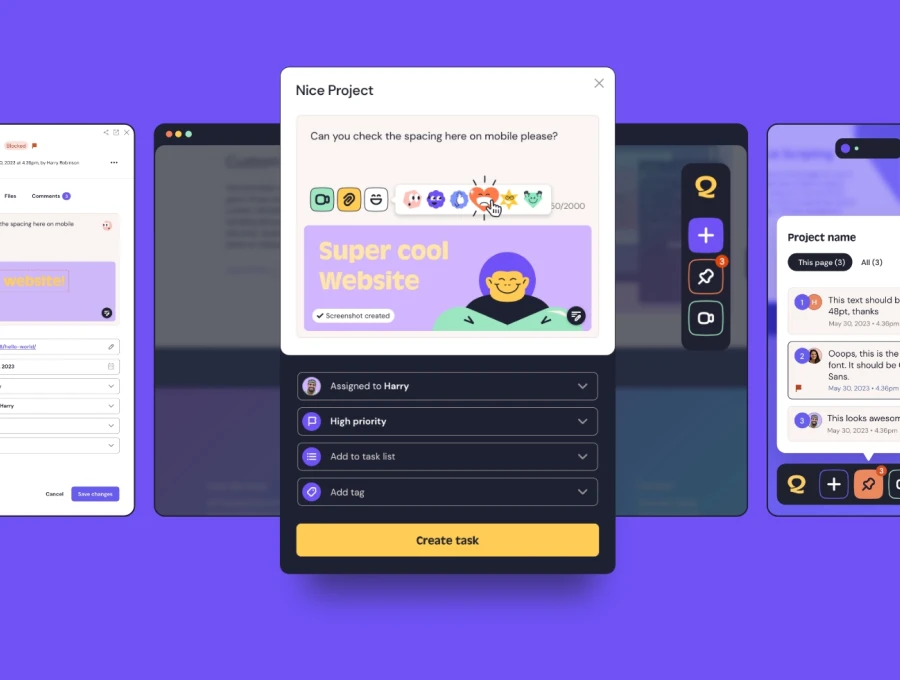
Raise tasks in under 3 seconds using our revolutionary widget
4. Proof: back up the claim, close to the claim
Proof is anything that lets a visitor check what you have said. Named testimonials with a role and company, client logos used with permission, real photographs of your work, accreditations and figures you can substantiate all count.
Nielsen's guidelines also ask for meaningful graphics, such as photos of real people connected to the topic in place of stock models.
Put proof next to the claim it supports.
Give every testimonial a real name and company.
Use numbers only if you can show where they came from.
Test: claim list. Write down each claim the homepage makes. Beside each one, note the proof within one scroll. Claims with nothing beside them get proof or get cut.
Test: source check. For each testimonial and figure, ask whether you could defend it if challenged. If you cannot name the source, take it down.
5. Speed: get the first screen on quickly
Google's Core Web Vitals set three "good" thresholds at the 75th percentile of page loads: LCP within 2.5 seconds, INP of 200ms or less and CLS of 0.1 or less. Homepages tend to carry the heaviest image on the site, so loading is usually the one to fix first.
Serve images at the size they display, in a modern format.
Set width and height on images and embeds to stop layout shift.
Cut homepage-only scripts such as sliders, chat widgets and marketing pixels you no longer use.
Avoid autoplaying background video on mobile.
Test: PageSpeed Insights. Run the homepage on the mobile setting. Use the field data if your site has enough traffic to show it, and check which element is the LCP.
Test: a real phone. Load the page on a mid-range phone on mobile data. Our guide to testing on real devices explains how to set this up.
6. Accessibility: check it before you score it
Aim for WCAG 2.2 AA. The homepage is the front door, so a barrier here can stop someone reaching the rest of the site.
Meet contrast minimums: 4.5:1 for normal text and 3:1 for large text.
Test: put the mouse away. Press Tab through the page. Every interactive item should show a clear focus style, in a sensible order.
Test: W3C Easy Checks. Work through the W3C's Easy Checks for titles, headings, contrast and forms. Our WCAG compliance guide covers the wider principles.
The homepage review scorecard
Score each line 0 (fails), 1 (partly) or 2 (passes). Have two people score it separately, then compare.
Area
Test
Score
Hierarchy
Blur test: headline and button lead
/2
Hierarchy
Headings tell the story
/2
Message
Five-second test passes
/2
Message
Competitor swap: headline only fits you
/2
Calls to action
One primary button per screen
/2
Calls to action
Labels make sense alone
/2
Proof
Every claim has nearby proof
/2
Proof
All proof has a named source
/2
Speed
LCP within 2.5s on mobile
/2
Speed
CLS of 0.1 or less
/2
Accessibility
Keyboard focus visible throughout
/2
Accessibility
Text meets contrast minimums
/2
Total
/24
As a starting point, 20 or more is ready to launch, 14 to 19 needs the zeros fixed first and anything under 14 needs the message and hierarchy rethought before any polish. Treat a 0 on either Message line or either Accessibility line as a blocker, whatever the total says.
When several people review a homepage, comments like "the bit near the top" waste everyone's time. A website annotation tool such as QualityHive pins each comment to the exact element with a screenshot. For how to phrase those comments, see how to give website feedback.
Homepage mistakes to catch
A carousel as the main message. Each slide competes with the others, and the one you most need read may only show for a few seconds.
A cookie banner covering the main button on a phone. Check the first screen with the banner showing.
Treating the fold as a fixed line. Screen sizes vary too much, so design for a strong first screen on phone and desktop.
Designing around placeholder copy. Real headlines are longer, so write them first.
A headline saying what you offer and who it is for, one main call to action, proof such as named testimonials, routes to your main pages and an easy way to get in touch.
How long should a homepage be?
Long enough to answer what a new visitor needs to know before taking the next step. A local service may need four or five sections and a complex product may need more. Watch real visitors and cut what nobody uses.
Should a homepage use a carousel?
Usually not for the main message. Slides compete with each other, and WCAG expects a way to pause content that moves on its own. A single strong headline is easier to test and easier to read.
How do you measure whether a homepage is working?
Track clicks on the main call to action, the share of homepage visitors who reach your key pages and completed enquiries or orders from those visits. Compare before and after each change.