Essential cookies enable core functionality. The website cannot function properly without these cookies, and they can only be disabled by changing your browser preferences.
Advertisement cookies are used to provide visitors with relevant ads and marketing campaigns. These cookies track visitors across websites and collect information to provide customized ads.
Used to identify individual clients behind a shared IP address and apply security settings on a per-client basis.
By selecting “Accept all” you allow QualityHive and our partners to use cookies and to share your data for all these purposes.
We and our partners use cookies and similar tools to measure our site's audience, evaluate the performance of our ads, and show you personalized content and ads.
Except for cookies that are essential for navigating our site, we use these cookies and share your data only with your consent.
Automate client feedback with our MCP serverLearn more!
Resizing your browser window is not device testing. It is a useful approximation of layout, and it tells you almost nothing about how your site actually behaves in someone's hand.
This post covers what emulators genuinely miss, and the realistic options for testing on real hardware when you cannot justify buying a cupboard full of phones.
What Browser Dev Tools Cannot Tell You
Responsive mode in Chrome changes the viewport size while still using your desktop machine's rendering engine, processor and network. That gap hides several categories of bug.
It will not show you real touch behaviour, where tap targets that look fine with a mouse cursor turn out to be too small or too close together for a thumb. It will not show you genuine performance, because your development machine is dramatically faster than a mid-range Android handset. It will not reproduce the mobile Safari engine, since your desktop Chrome is still Blink.
It also misses the on-screen keyboard covering form fields, momentum scrolling, and how the site behaves on a poor mobile connection. Those are exactly the issues users complain about.
Option 1: Use the Devices Your Team Already Owns
The cheapest device lab is the phones in your colleagues' pockets. Between a small team you usually have a spread of iOS and Android, old and new, large and small, at no cost at all.
Both platforms support remote debugging over USB, so you can inspect a real mobile page from your desktop dev tools: Safari Web Inspector for iOS via a Mac, and Chrome DevTools remote debugging for Android from any operating system. This gives you a real engine with a proper console.
Save countless hours on your projects
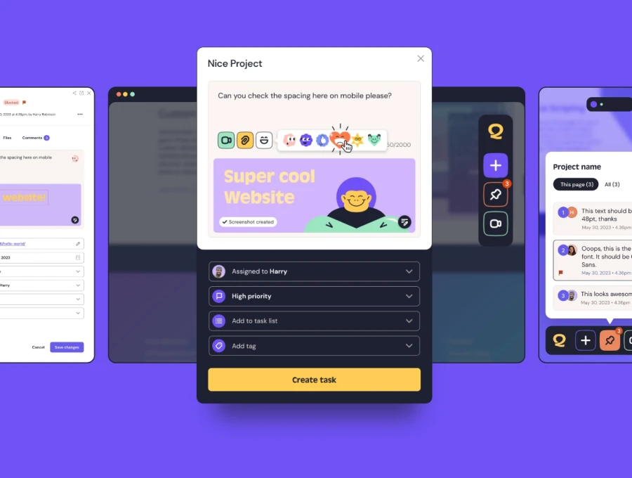
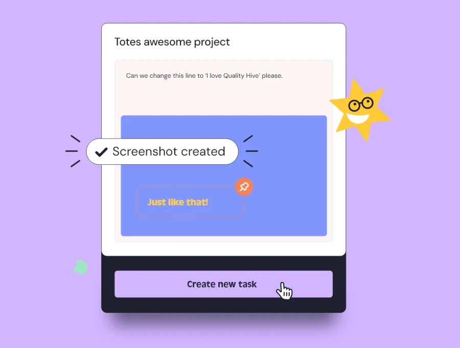
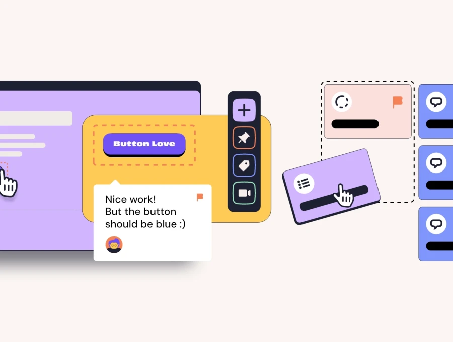
Raise tasks in under 3 seconds using our revolutionary widget
Option 2: Cloud Device Labs
Services such as BrowserStack, LambdaTest and Sauce Labs stream genuine devices over the web, giving you real hardware and real browser engines without owning anything. This is the most practical answer for Windows-based teams who need genuine Safari coverage.
The trade-off is cost and latency. Streamed sessions feel sluggish, which makes them poor for judging real performance even though they are excellent for judging rendering and functionality.
Option 3: Buy Two Cheap Phones
If you build for the public, one budget Android handset and one older iPhone will teach you more than any amount of emulation. Deliberately choose slow, low-end hardware rather than flagships, because your users are not all carrying the newest device and a mid-range phone from three years ago is far closer to the median visitor.
Testing on genuinely slow hardware is the fastest way to discover that your homepage carousel is unusable outside the office.
Build a Device Matrix You Can Actually Maintain
You cannot test everything, so decide what matters using your own analytics rather than a generic list. Pull the top devices, browsers and screen sizes from your traffic and cover those. For most sites a handful of combinations accounts for the overwhelming majority of visitors.
Review it once or twice a year as the mix shifts. Our guide to cross-browser testing covers how to keep that matrix realistic, and the website testing checklist shows where device checks sit in a full pre-launch pass.
Capture Device Context Automatically With QualityHive
Device testing produces its own reporting problem. Someone finds a bug on a phone, and now they are trying to describe it, screenshot it and remember the OS version, all on a small screen.
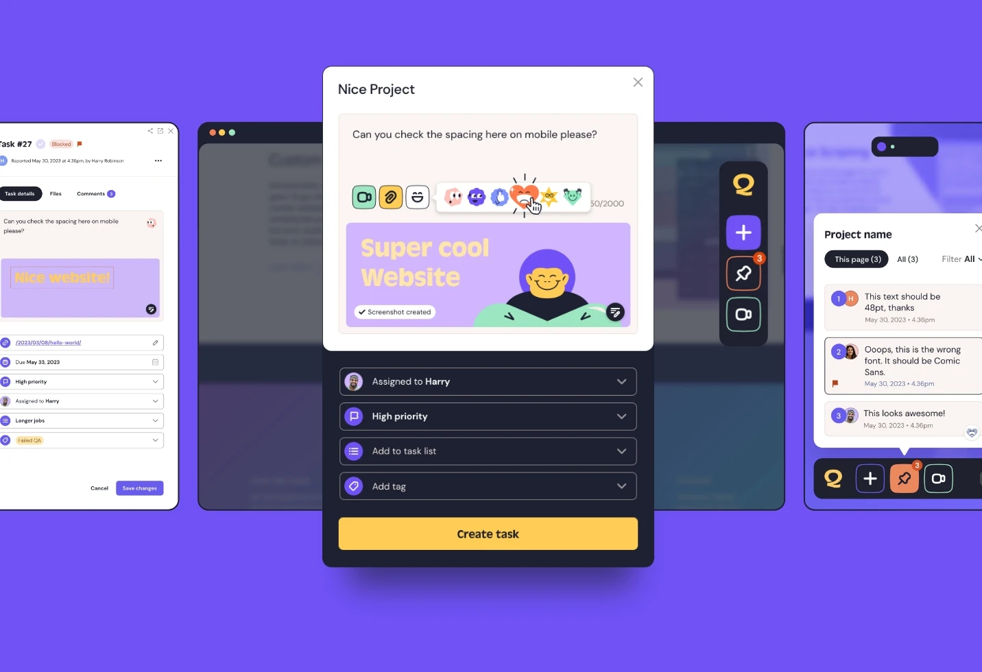
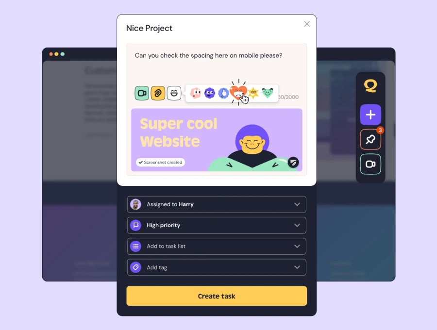
QualityHive captures the device, operating system, browser, version, viewport size and console errors automatically when an issue is raised, straight from the phone the tester is holding. Your developer gets the full context without a single follow-up question.
To make testing on real devices as easy as testing on your desktop, start a free trial.