Essential cookies enable core functionality. The website cannot function properly without these cookies, and they can only be disabled by changing your browser preferences.
Advertisement cookies are used to provide visitors with relevant ads and marketing campaigns. These cookies track visitors across websites and collect information to provide customized ads.
Used to identify individual clients behind a shared IP address and apply security settings on a per-client basis.
By selecting “Accept all” you allow QualityHive and our partners to use cookies and to share your data for all these purposes.
We and our partners use cookies and similar tools to measure our site's audience, evaluate the performance of our ads, and show you personalized content and ads.
Except for cookies that are essential for navigating our site, we use these cookies and share your data only with your consent.
Automate client feedback with our MCP serverLearn more!
To review a website, agree what it is meant to do, go through it in separate passes, write each problem as a specific finding, then score it and give a clear recommendation. This page gives you that method, a worked example for a fictional site and a template for writing it up.
A review answers a different question from testing, so it needs its own process.
Activity
Question it answers
Usually done by
QA
Does it work?
QA tester
UAT
Does it meet our needs?
Client or end users
Review
Is it good enough to launch?
Someone who did not build it
Our website QA guide and guide to UAT cover the other two. Run the review once QA is mostly done, so you are judging the site and not tripping over known bugs.
The method in seven steps
Set the scope. Note the URL, build, date, pages, devices and who the site is for.
Read the brief. You cannot judge a site without knowing what it is meant to achieve.
Do the main task as a first-time visitor. On a phone, before looking at any detail. Time it and note where you get stuck.
Make separate passes. Look at one thing at a time, using the table below.
Write each issue as a finding. Say where it is, what you expected, what happened, how serious it is and what proves it.
Score each area. Weight the areas so the score reflects what matters for this site.
Write the verdict. Ready, ready after fixes or not ready, with the conditions spelled out.
The passes
Pass
Look for
Time
Purpose
Clear offer, obvious next step
15 min
Content
Accuracy, tone, spelling, gaps
45 min
Design
Hierarchy, consistency, spacing
30 min
Function
Forms, links, search, payments
45 min
Accessibility
Keyboard, contrast, alt text
20 min
Performance
Core Web Vitals on mobile
10 min
SEO basics
Titles, canonicals, indexing
15 min
That is about three hours for a 15-page site. Separate passes matter because you notice different things when you are only reading the words. For accessibility, work through the W3C's Easy Checks. For performance, compare against the Core Web Vitals thresholds: LCP within 2.5 seconds, INP of 200ms or less and CLS of 0.1 or less. For a closer look at the first page people see, use the scorecard in our homepage design best practices.
How to write a finding
"Contact page is broken on mobile" gives whoever picks it up nothing to work with. This does:
F-03 | High | /contact | iPhone, SafariExpected: After sending the form, a confirmation message appears.Actual: The page reloads with no message. The enquiry does arrive.Evidence: Screen recording, 14 seconds.
Grade severity by the effect on the visitor. Critical blocks a key task or loses money, High seriously harms a key task, Medium is a clear problem with a workaround, Low is cosmetic. See bug severity vs priority for how that differs from what gets fixed first.
Label opinions as suggestions so they do not get mixed up with faults. For the wording itself, how to give website feedback has examples.
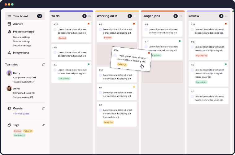
Typing findings into a document gets slow once screenshots are involved. QualityHive's website review tool turns a click on the page into a task with a screenshot and the exact element pinned, and on Lite and above it captures browser, OS and screen size too.
Save countless hours on your projects
Raise tasks in under 3 seconds using our revolutionary widget
Worked example: a review of a fictional bakery site
Harbour Lane Bakery is a made-up local bakery. The new site's job is to take cake orders for collection or delivery. Everything below is invented to show the format.
Scope: 12 pages, staging build 1.4, reviewed on iPhone Safari, Android Chrome and Windows Chrome.
First-time visitor task: Order a birthday cake for delivery on a phone. It took 4 minutes 30 seconds, with one sticking point at the delivery date field, which needed a second tap to open.
Scoring table
Points are weight multiplied by score, divided by 5. Function carries the most weight here because taking orders is the site's job.
Area
Weight
Score /5
Points
Purpose and message
20
4
16
Content
15
3
9
Visual design
10
4
8
Function
25
2
10
Accessibility
15
3
9
Performance
10
3
6
SEO basics
5
4
4
Total
100
62
A simple way to read the total: 80 or more is ready, 60 to 79 is ready after fixes and under 60 is not ready. Any Critical finding means not ready, whatever the score.
Findings
ID
Severity
Page
Finding
F-01
Critical
/order
Delivery fee missing on iPhone
F-02
High
/order
Date picker needs two taps
F-03
High
/contact
No confirmation after sending
F-04
Medium
Home
Headline does not say what or where
F-05
Medium
/cakes
Cake photos have no alt text
F-06
Medium
All
No visible keyboard focus on nav
F-07
Low
All
Same meta description everywhere
F-08
Low
Footer
Copyright year shows 2025
The write-up
This is the part that gets read, so keep it short and end with the decision.
WEBSITE REVIEW: Harbour Lane Bakery (fictional)Build: Staging 1.4 Score: 62 / 100Reviewed on: iPhone Safari, Android Chrome, Windows ChromeVerdict: Not ready to launch.The site looks good and the offer comes across quickly. The scorewould normally mean ready after fixes, but one Critical findingblocks launch. On iPhone Safari the delivery fee does not appearin the order total, so customers are shown the wrong price.Fix before launch: F-01, F-02, F-03Fix within two weeks: F-04, F-05, F-06Backlog: F-07, F-08Retest: F-01 to F-03 on the next build, on the same devices.A full re-score is not needed unless the order flow changes.
Notice how the score and the verdict disagree. That is deliberate. A weighted score tells you how the whole site is doing, and the severity rule stops a good average hiding one problem that would cost real orders.
Website review template
Copy this for your next review and adjust the weights to suit the site.
WEBSITE REVIEWSite and URL:Build or version: Date:Reviewer: Reviewed for:Goal of the site:Pages and devices covered:First-time visitor task:Result and time taken:SCORES (points = weight x score / 5)Area Weight Score /5 PointsPurpose and messageContentVisual designFunctionAccessibilityPerformanceSEO basicsTotalFINDINGSID | Severity | Page | Device | Expected | Actual | EvidenceVERDICT: Ready / Ready after fixes / Not readyFix before launch:Fix after launch:Backlog:Retest plan:
Mistakes that weaken a review
Reviewing only on a desktop. Do the first-time visitor task on a phone, because that is where forms and menus tend to fall over.
Mixing opinions with faults. "I would prefer blue" and "the button does nothing" need different responses.
The builder reviewing their own work. They know where to click, so they never hit the confusing parts.
No retest. A finding is only closed when someone has checked the fix on the same device.
Revolutionise your QA processes
FAQ
How do you write a website review?
State the scope, score each area against a weighted table, list findings with their severity and finish with a clear verdict. Keep opinions separate from faults, and put the decision at the top so people can act on it.
How long does a website review take?
About three hours for a 15-page site with the passes above. A single-page site can take under an hour, and a large e-commerce site needs a sample of each template.
Who should review a website?
Someone who did not build it, ideally with the brief in hand. A second reviewer from outside the project helps, because they will not know how the site is supposed to work.
What should a website review example include?
The scope, a scoring table, specific findings with severity and evidence, and a verdict stating what must be fixed before launch. The bakery example above shows all four.