Essential cookies enable core functionality. The website cannot function properly without these cookies, and they can only be disabled by changing your browser preferences.
Advertisement cookies are used to provide visitors with relevant ads and marketing campaigns. These cookies track visitors across websites and collect information to provide customized ads.
Used to identify individual clients behind a shared IP address and apply security settings on a per-client basis.
By selecting “Accept all” you allow QualityHive and our partners to use cookies and to share your data for all these purposes.
We and our partners use cookies and similar tools to measure our site's audience, evaluate the performance of our ads, and show you personalized content and ads.
Except for cookies that are essential for navigating our site, we use these cookies and share your data only with your consent.
Automate client feedback with our MCP serverLearn more!
You build a site, it looks perfect in Chrome, and then someone opens it on an iPhone and half the layout has moved. Safari has a long reputation for being the awkward browser, and while that is a little unfair, there are genuine technical reasons why the same code produces a different result.
This post explains what actually causes those differences, which ones matter, and how to catch them before they reach a client.
Safari Uses a Different Rendering Engine
Chrome and Edge both use Blink. Firefox uses Gecko. Safari uses WebKit, and on iOS every browser uses WebKit, including Chrome for iPhone. That last point surprises a lot of developers: installing Chrome on an iPhone does not give you Chrome's engine, so testing "Chrome on mobile" on an iOS device tells you nothing about Chrome on Android.
Different engines implement new CSS features on different timelines, and they interpret ambiguous parts of the spec differently. Most of what looks like a Safari bug is really a feature that shipped in Blink first.
The Most Common Causes of Safari-Only Layout Problems
Viewport height is the classic one. Using 100vh on mobile Safari famously includes the area behind the address bar, so a full-height section ends up taller than the visible screen and content gets pushed under the browser chrome. The newer dvh, svh and lvh units exist specifically to solve this.
Flexbox and grid gaps are another frequent offender, as gap support in flex containers arrived in Safari noticeably later than in Chrome. Older Safari versions silently ignore it, collapsing your spacing to nothing.
Beyond that, watch for date input formatting, which Safari renders in its own style; scroll behaviour and momentum scrolling, which feels entirely different on iOS; backdrop-filter, which is expensive and sometimes ignored; and form autofill, which Safari restyles aggressively with its own yellow background.
Save countless hours on your projects
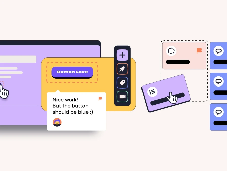
Raise tasks in under 3 seconds using our revolutionary widget
Fonts and Images Render Differently Too
Safari applies its own font smoothing, so the same weight can look noticeably lighter or heavier than it does in Chrome on the same screen. This is not a bug and cannot really be fixed, only accounted for. If your design depends on a very thin weight, check it on macOS before signing it off.
Image format support has also historically lagged. WebP took a long time to arrive in Safari, and AVIF longer still, so always ship a fallback rather than assuming a modern format will decode everywhere.
How to Actually Test Safari Without Owning a Mac
This is the practical problem for a lot of teams, particularly Windows-based agencies. Safari has not shipped for Windows since 2012, and the versions floating around online are a decade out of date and a security risk.
Realistically you have three options: use a real Mac or iPhone, use a cloud device lab that streams a genuine Safari session, or use a macOS virtual machine. Browser dev tools that merely resize the window do not help here, because responsive mode still uses your own engine. We go into this in detail in our guide to testing on real devices.
Build a Safari Check Into Your Release Process
The mistake most teams make is treating Safari as an afterthought, discovered by a client on their iPhone after launch. Given how much global mobile traffic runs through iOS, it deserves a place in your standard pre-launch pass rather than a panicked fix afterwards.
At minimum, check every key template at one mobile width and one desktop width in Safari before handover. Our website testing checklist covers where this fits alongside the rest of your pre-launch checks, and cross-browser testing goes deeper on building a browser matrix that is actually achievable.
Catch Safari Issues Before Your Client Does With QualityHive
The awkward part of browser-specific bugs is the reporting. A client says "it looks wrong on my phone", sends a photo of a screen, and nobody knows which iOS version or screen width produced it.
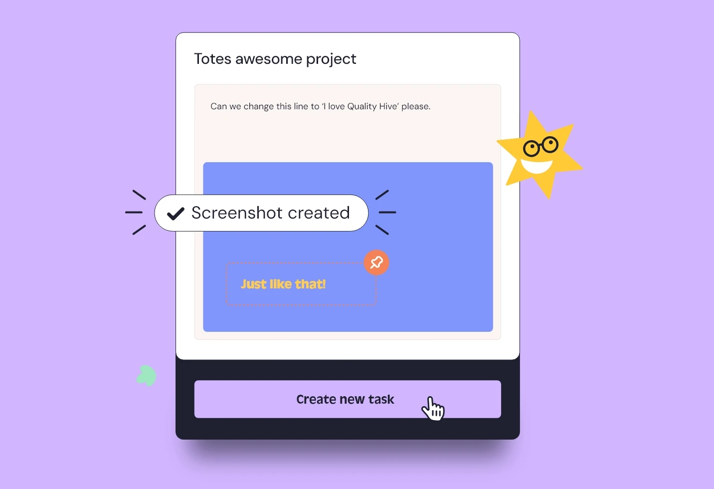
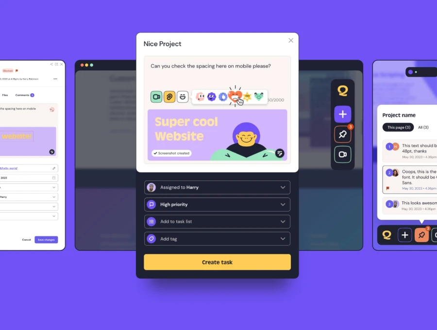
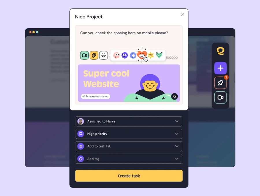
QualityHive lets anyone report an issue directly on the page, capturing a screenshot along with the exact browser, engine, version, device and viewport size automatically. When the report says Safari 17 at 390px wide, your developer knows where to start.