Essential cookies enable core functionality. The website cannot function properly without these cookies, and they can only be disabled by changing your browser preferences.
Advertisement cookies are used to provide visitors with relevant ads and marketing campaigns. These cookies track visitors across websites and collect information to provide customized ads.
Used to identify individual clients behind a shared IP address and apply security settings on a per-client basis.
By selecting “Accept all” you allow QualityHive and our partners to use cookies and to share your data for all these purposes.
We and our partners use cookies and similar tools to measure our site's audience, evaluate the performance of our ads, and show you personalized content and ads.
Except for cookies that are essential for navigating our site, we use these cookies and share your data only with your consent.
Designing websites that look great on all devices is a crucial skill for web designers. One of the key aspects of responsive web design is choosing the right container sizes and breakpoints. This ensures that your content adjusts smoothly across different screen sizes, providing an optimal user experience. In this article, we’ll explore the best practices for selecting container sizes and breakpoints, helping you create designs that work seamlessly on desktops, tablets, and mobile devices.
Understanding Breakpoints
Breakpoints are the specific screen widths at which your website's layout will change to accommodate different device sizes. Choosing the right breakpoints is essential for creating a responsive design that works well on a variety of screens. The most common breakpoints are:
Mobile: 320px - 480px
Tablet: 481px - 768px
Small Laptop: 769px - 1024px
Large Laptop/Desktop: 1025px - 1200px
Large Desktop: 1201px and above
These breakpoints are not set in stone but serve as a general guideline. Depending on your target audience and the types of devices they use, you might need to adjust these breakpoints slightly.
Optimal Container Sizes
Container sizes determine the maximum width of your content. Using optimal container sizes ensures that your design remains readable and visually appealing across different devices. Here are some recommended container sizes for various breakpoints:
1. Mobile Devices (320px - 480px)
For mobile devices, the container width should typically be between 320px and 480px. Since screen real estate is limited, using a fluid or full-width container is often the best approach. This allows your content to adjust seamlessly to the small screen size.
Example: Container width of 100% with appropriate padding and margins.
2. Tablets (481px - 768px)
Tablets offer more space than mobile devices but still require a flexible design. A container width of 720px to 768px works well for most tablets. This size allows for comfortable reading and interaction without overwhelming the user with too much content on the screen.
Example: Container width of 720px with 20px padding on each side.
3. Small Laptops (769px - 1024px)
For small laptops and larger tablets in landscape mode, a container width of 960px is often ideal. This size provides ample space for content while maintaining a clean and organized layout.
Example: Container width of 960px centered on the screen with flexible margins.
4. Large Laptops and Desktops (1025px - 1200px)
Large laptops and desktop monitors have more screen real estate, so you can increase the container width to 1140px to 1200px. This width is suitable for displaying detailed content, multiple columns, and larger images without sacrificing readability.
Example: Container width of 1140px centered on the screen.
5. Large Desktops (1201px and above)
For very large desktop monitors, you can use container widths up to 1440px or even wider if needed. However, it’s essential to ensure that the content doesn’t become too stretched out, which can negatively impact readability and aesthetics.
Example: Container width of 1440px centered on the screen with generous margins.
Fluid vs. Fixed Container Sizes
When designing responsive websites, you’ll need to decide between fluid and fixed container sizes:
Fluid Containers
Fluid containers adjust their width based on the screen size, using percentages rather than fixed pixel values. This approach allows your layout to adapt dynamically to different devices and screen resolutions.
Advantages: Better adaptability, smoother transitions across breakpoints, and improved user experience on various devices.
Disadvantages: Can be more challenging to design and test, especially for complex layouts.
Fixed Containers
Fixed containers have set widths that don’t change based on the screen size. While this approach can simplify design and ensure consistent layouts, it may not provide the best user experience on smaller or larger screens.
Advantages: Easier to design and control, consistent layout.
Disadvantages: Less adaptable to different screen sizes, potential for horizontal scrolling on smaller devices.
Using Media Queries
Media queries are a fundamental part of responsive web design, allowing you to apply different styles based on the screen size. Here’s an example of how to use media queries to adjust container sizes for different breakpoints:
Using media queries in this way ensures that your container sizes adjust appropriately based on the screen width, providing a seamless and responsive experience for users.
Revolutionise your QA processes
Best Practices for Container Sizes and Breakpoints
Here are some best practices to keep in mind when choosing container sizes and breakpoints:
1. Start with a Mobile-First Approach
Designing with a mobile-first approach means starting with the smallest screen size and gradually adding styles and features as the screen size increases. This approach ensures that your website is optimized for mobile users, who often make up a significant portion of your audience.
2. Test on Real Devices
While browser developer tools are useful, testing on actual devices provides a more accurate representation of how your website will look and function. Make sure to test on a variety of devices and screen sizes to catch any issues that might not be apparent in a simulated environment.
3. Prioritize Content
Ensure that your most important content is easily accessible on all screen sizes. Use responsive design techniques to rearrange or hide less critical content on smaller screens, providing a streamlined and user-friendly experience.
4. Maintain Consistent Spacing
Consistent spacing and padding are essential for a cohesive design. Use relative units like percentages or rems to maintain proportional spacing across different screen sizes.
5. Optimize Images
Images can significantly impact the performance and loading times of your website. Use responsive images with the <picture> element or the srcset attribute to serve different image sizes based on the screen resolution.
Conclusion
Choosing the most optimum container sizes and breakpoints is essential for creating responsive web designs that look great on all devices. By understanding browser differences, utilizing fluid and fixed container sizes, leveraging media queries, and following best practices, you can ensure a seamless user experience across desktops, tablets, and mobile devices. Stay ahead of the curve by continuously testing and refining your designs, and you’ll be well on your way to mastering responsive web design.
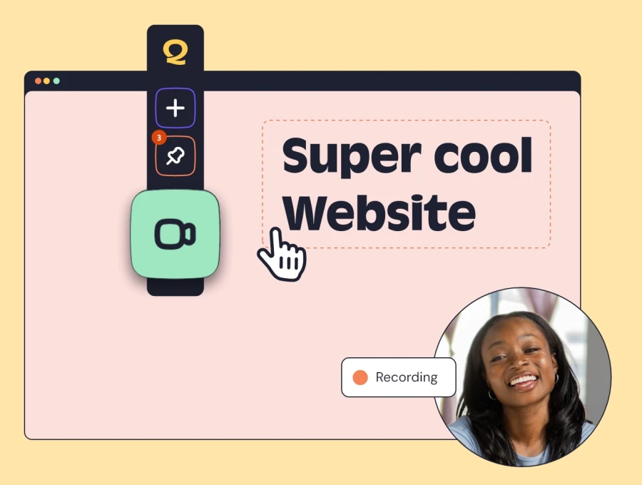
Save countless hours on your projects
Raise tasks in under 3 seconds using our revolutionary widget